KV Interview with the designer

เผยแพร่เมื่อ 2 years ago
Behind the Key Visual of Bangkok Design Week 2025
Blending All Things Thai into a Bold Design
With the Creative Minds of Pink Blue Black & Orange
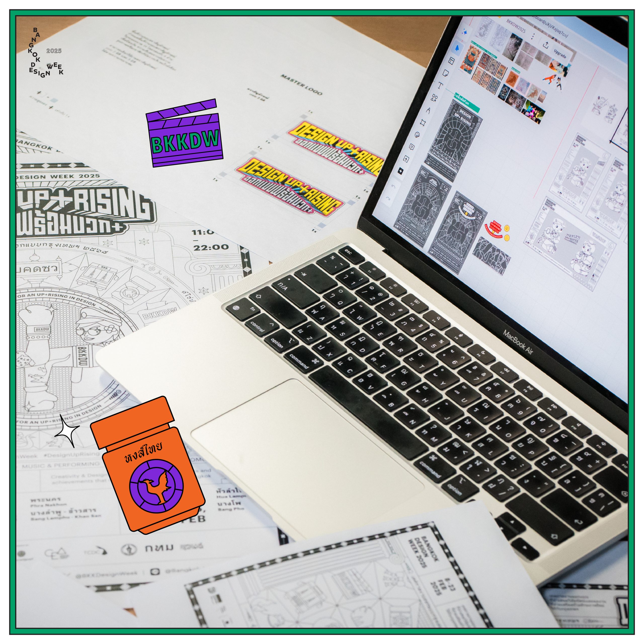
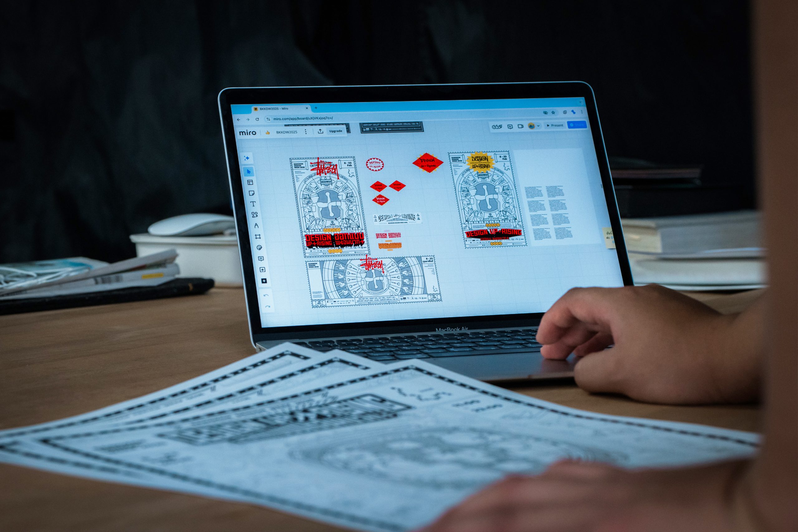
When it comes to Bangkok Design Week 2025 under the theme “Design Up+Rising: Facing Challenges with a Positive Twist,” the first thing that likely catches your eye is the bold and vibrant Key Visual. Packed with playful patterns, intricate details, and delightful easter eggs, it invites a smile from anyone who stops to look. But beyond its colorful and lively exterior lies a thoughtful design process and rich storytelling that infuses every element with purpose.
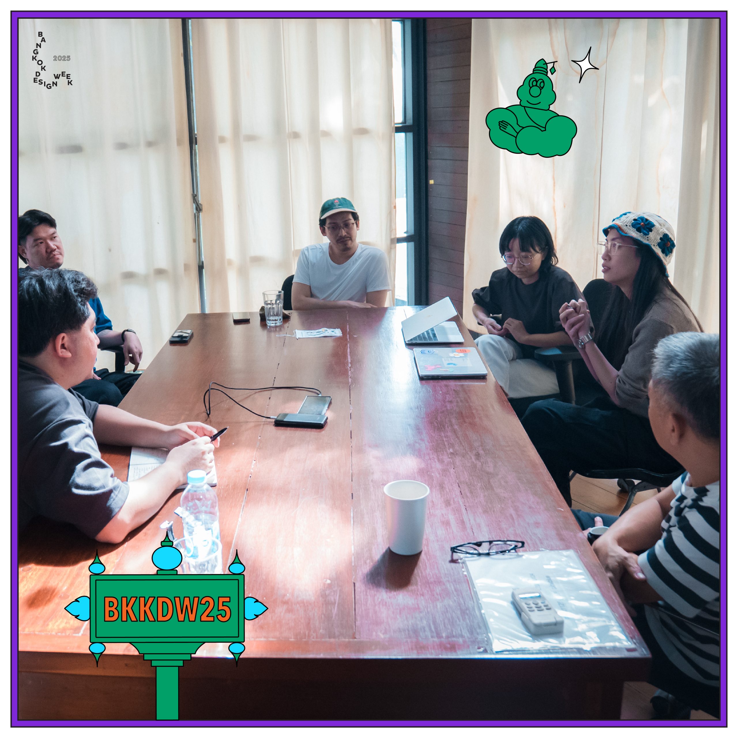
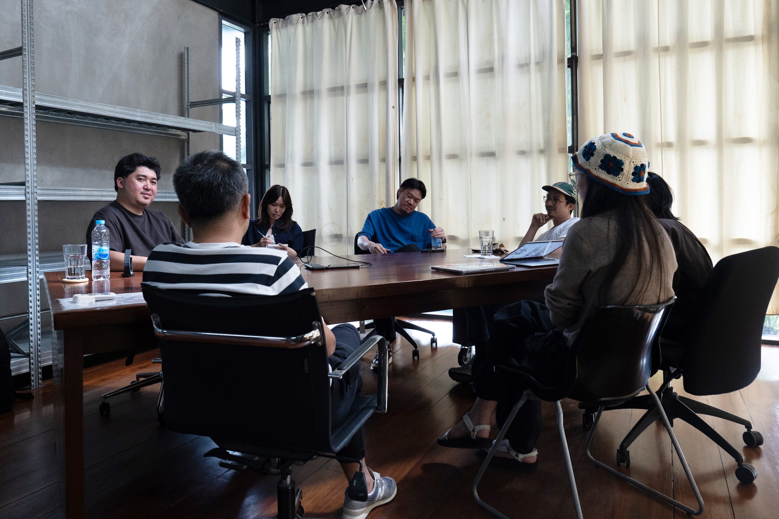
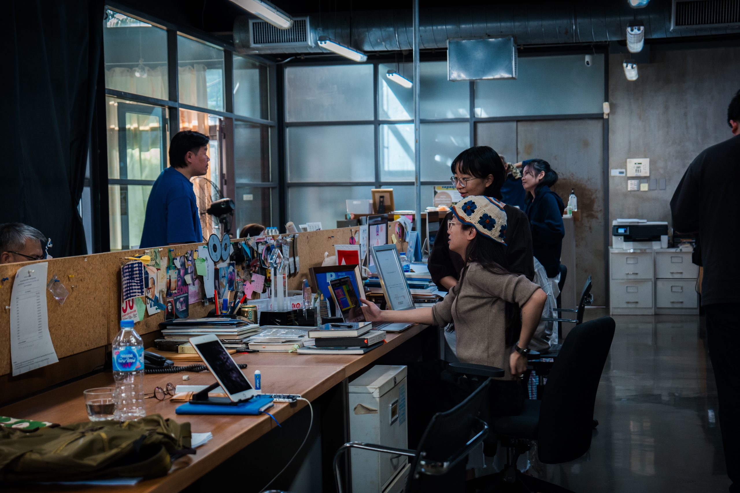
Let us introduce you to the creative minds behind this year’s Key Visual: Pink Blue Black & Orange, a dynamic design studio based in Bangkok’s Rama 9 district. Led by Siam Attariya, Teerapat Losuwanwong, Paput Nimcheua, Sa-aisara Thanavisut, and Patcharapha Pipatnadda, the team was tasked by CEA with a unique challenge—to extend the boundaries of design to reach a broader audience.
This collaboration of these five distinct creatives in one team ensured that the design process was innovative in concept and inclusive in execution. The result? A design that’s not just visually striking but also crafted through a dynamic process filled with experimentation. By reimagining ordinary, everyday elements and remixing them into something playful, approachable, and relatable, Pink Blue Black & Orange created a visual language that speaks to everyone.
Curious about the remix-level energy and bold ideas that went into this project? Dive into the behind-the-scenes story of their creative journey in this interview.
And stay tuned for the final_ok_finish_approve_v15.jpg version of Bangkok Design Week 2025’s Design Up+Rising: Facing Challenges with a Positive Twist. It’s coming soon!
Bangkok Design Week 2025
Design Up+ Rising
8-23 February 2025
Q: Why did CEA choose PBBO to design the Key Visual for Bangkok Design Week 2025?
Siam: This year, CEA wanted to expand the target audience beyond just the design industry or professional designers. They realized that design is ultimately a tool for everyone. When they spoke to local communities, it became clear that terms like “minimalist design” or “Italian design” might not resonate well with the locals. So, when CEA came up with the theme, it was unanimously decided—our team’s name immediately popped into their heads (laughs). We were fortunate that the personality of our work seemed to resonate with their vision.
Paputh: We believe this stemmed from a pain point CEA had encountered through feedback. They wanted something more inclusive that could engage local communities or simply people passing by the Design Week. They wanted these people to feel connected and realize that design is all around them, making it accessible and approachable.
Q: How did the process of brainstorming and developing ideas unfold during the early stages of the project?
Saiisra: We started with a brainstorming session where everyone shared ideas. We settled on a general direction and then explored each path further to see where it could take us.
Paputh: While exploring ideas, we noticed local designs and simple problem-solving approaches using everyday items, like pipes or leftover household waste. People repurpose them into something useful, which inspired us to see how ordinary people solve problems with their creativity.
Siam: We chose to work with familiar, everyday objects that might seem insignificant. Instead of following the notion that design has to be “cool” or “foreign,” we leaned into a more down-to-earth, relatable style — raw, simple, and unpolished.
Patcharapa: Creative problem-solving is about adapting what you have to meet your needs. People use creativity in their own way, and we see that as problem-solving. It’s not about “beauty” or “ugliness.” This approach broadened our perspective and helped us recognize potential in things that might otherwise be overlooked.
Q: How did the concept of “Thainess” become part of the design?
Paputh: It started with things we see every day — stickers, signs, and graphics made by regular people, not designers. They have a raw, playful charm and stand out with their Thai colors, intricate details, and that “everything mixed together” style. It’s a visual language that’s bold, fun, and uniquely Thai.
Siam: Look at temple walls with mosaic tiles or a likay costume — there’s no blank space! Every inch is packed with gold, green, and sparkle. Every finger is adorned with rings. That’s when we knew subtle wasn’t an option. We had to go big, like a “spicy salad” of design.
Thai people have always embraced outside influences — Japanese trends, Indian movies, Korean pop. We mix it all up until it becomes part of us. That spirit of free-form creativity is what we wanted in our Key Visual.
Saiisra: We wanted every element to feel familiar, something people can relate to. It’s about reflecting everyday lives — maybe a motorbike taxi, a local vendor, or a community trade. When people see themselves in the design, it sparks a connection. It’s about making the work feel interactive and inclusive.
Q: Could you explain the concept behind the unique release strategy for the Key Visual?
Siam: We wanted to communicate with the community that, for us, design is a process. We don’t always know the final outcome from the start. It’s like how locals create solutions with random materials — they just make it work. If they had a clear image in mind, they’d probably draft a plan and hire someone to do it. But in reality, they just figure it out as they go, improvising along the way.
Patcharapa: It’s challenging, like Siam said, because there’s no clear final image to aim for. If it were “minimal,” everyone would know what that looks like. If it were “pop art,” we’d have a reference. But this project is about blending everything together, so the final result isn’t easy to visualize from the start.
Paputh: This is the nature of design. If there were unlimited time and budget, you could keep tweaking forever. But every design project needs a timeline and a clear finish line. That deadline becomes the point where the current version of the work is done.
Siam: We started in October, and the event isn’t until February. If we launched a fully finalized Key Visual right from the start and used it for 3-4 months, it wouldn’t be as effective in sustaining attention. Since we have time, we let the design evolve like a growing tree. When the timing is right, it blooms, and that’s when we reap the rewards.
Q: What challenges did you face in communicating this Key Visual?
Siam: From a broader perspective, people often associate design with sleek, luxurious, or high-end qualities. However, we wanted to invite everyone to see that everything humans create is designed in some way—whether by professionals, designers trained abroad, or even locals crafting things themselves.
Teerapat: At the company, we have to follow client briefs, so everything has to be perfect, polished, and precise. But for this project, we faced uncertainty. We wanted it to be good and cool, but weren’t sure what kind of “cool” it should be. Our Art Director, Siam, reminded us that the goal was to make the design accessible to everyone. To do that, we had to set aside our own preferences and shift our approach, which took some time to figure out.
Paputh: I told Siam about a chat I had with a graphic designer. He said he loved the Key Visual for Bangkok Design Week. I explained that we aimed to make it feel unpolished and grounded. But he replied, “It’s super cool.” I was a bit confused, like, “Really?” (laughs). Maybe he saw a kind of “cool” that we didn’t expect.
Q: What lessons has this Key Visual taught you as designers?
Patcharapa: It’s about broadening how we see design. If you look closely, design is everywhere in daily life — even choosing what to wear is a form of design. The more we observe our surroundings, the more we realize how design improves our lives. It makes us think about how we can adopt and apply these ideas in our own way.
Siam: I see it as a way of inviting people to view design in the same way they might approach superstitions. You can’t always prove that design—or belief for that matter—guarantees business success, but it does create confidence and assurance. A good design can at least ensure a positive mindset, a sense of security, and self-assurance.
We want people to see design as a process of problem-solving. It’s about taking something and shaping it toward a goal. Turning a plastic bottle or can into a plant pot? That’s design. We want people to realize they can be designers too. They can combine ideas, mix and match, and create something new — and that process of “adding things up” can lead to changes in their lives, careers, or businesses.
Bangkok Design Week 2025
Design Up+ Rising
8-23 February 2025